Wobble Tutorial
Wobble Tutorial
Someone asked for a tutorial on how I make my art wobble like in the above gif, so that’s what this is! It’s not very hard, all you need is a drawing program with layers, preferably Photoshop or another one with animation capabilities, but if you don’t have one, you can just export the frames individually as jpgs or pngs and compile them in another program or online gif maker. I’ll be using Photoshop in this tutorial because that’s the program I use.
Czytaj dalej
More Posts from Nastysynth and Others
I have no Idea how many people know this but its a life saver

Start off with a crappy scanned/phone taken picture like so

Mess around with the SAI Filters, I usually go color deepen all the way to the left then mess with brightness and contrast until I find a good balance I like, then to top it off with a copied layer on multiply to make the lines darker

Click what I boxed off and the magic has already happened

you now are left with a clean lineart layer that you can color underneath to your liking : 0 Hell you can even color your lines however you want as well for a colored lineart
Tusks!

no trouble at all! Here are some visual notes on how i approach orc teeth.
1: get familiar with the structure.

The better you can visualise the structure of teeth and where the tusks “plug in”, the easier step 2 will be.
2: simplify.
You only need to draw what will be visible. Don’t worry about drawing the anatomy right every time. If you get familiar with the structure underneath, it will be easier to spot when something’s off in your sketch.

Works for upper tusks and lower! Visualise –> Simplify

Oh yeah I made these skin tone swatches for me to use for colouring style consistencies sake but hey they might be useful to other people so I made them into one image and woo now y’all can use them lol
Probably aren’t perfect but hey they do the trick for me well enough :p


people have asked me how i draw eyes so i made an extremely slap-dash eye tutorial! this is simply about how i draw a simple neutral eye, nothing to do with expressions (that’s a whole other thing).
start with the horizontal guide on the face, to help place the eyes. put circles where the eyes will go!
adjust the circles into diamond shapes– i got this idea from sinix design on youtube, it’s very helpful and easier to see where the lids should end than with a circle.
draw the top lid/lash lines, leaving a bit of space at the top of the diamond. keep each eye in time with each other– drawing one whole eye first makes it harder to match the other one.
then the bottom lids. i usually try to do all the lid shapes with a single curved stroke each. keep it simple pals!
irises & pupils. sometimes i’ll draw filled-in black circles for the irises, to help figure out where to place them naturally!
lid creases, use the leftover diamond at the top as a loose guide for where to place them. remember that the lid curves around the eyeball.
make adjustments! things don’t always come out perfect immediately. i usually have to thicken the lash line (i like mine quite thick), move the bottom lid up or down, and sometimes resize a whole eye (easier on computer than traditional, i know!). if you’re on a computer make sure to flip your canvas often so you can see these little things ❤
and to practice, just doodle a lot of small eyes! keeping them small makes them easier and faster to finish, so you can focus on your strokes and playing around with shapes, tilt, lid space, all that. don’t worry about making the irises perfect circles/ovals or any of that, just try to capture the character. have fun!
i have an arty question. what program do you us, how do you shade? i'm actually in love with your art style and i was wondering for some time if you could give away any tips :) i just started digtal art and i can't draw as good as i do on paper so anything is helpful
Oooh buddy, I LOVE making tutorials and explaining my way of drawing so prepare for a long (and hopefully helpful) post! >:D
Ok so first of all: I use Clip Studio paint pro and a simple Bamboo Manga Tablet from Wacom. (I’ve been using this tablet for 8 years now and it still works perfectly fine and never gave me any trouble!~ It has a great pen pressure, setting it up is very easy and it’s not super expensive)
I tried many different art programs and Clip Studio (back then it was called mangastudio 5) is still my absolute favorite. It provides you with everything you need as an artist, is very easy to understand and not as overpriced as other programs (I’m looking at you photoshop). So if you don’t have a lot of money (like me, I’m fucking poor X’D) and still want something of quality I’d definitely recommend it.
Time for the brushes:

My main brush for outlines and sketches

My absolute fav brush for shading (Opacity is around 40%)
The 2 brushes that are displayed up here are part of a set that you can download for free on this page. I love them for their rough look and they fit my sketchy art style perfectly. Sadly I can’t find the original set anymore but I made screenshots of their names:

I cannot stress this enough but you should always download new brushes and try them out. And this page is perfect for that (nearly all of them are free)! Using new brushes and combining different ones can give your art so much more personality.
But just a quick tip. I know that the range of brushes is gigantic and can be quite overwhelming. So download everything that might interest you, try them all out and only keep as little as possible! Having too many brushes will confuse you and you’ll spend more time searching through them than drawing. I’ve downloaded over 400 and only kept around 20. I only use 2 of them for my drawings and the rest is for manga backgrounds and action lines.
Now for the drawing itself:

I’m a quick artist and I care more about speed than quality. I always hated making multiple sketches so I’ll just draw the outlines
-

and fix them up without a previous sketch or making a new layer. That’s why most of my drawings look very rough and don’t have a clean look. (but I like that~)
-

For the color, I just fill in the entire picture with a neutral looking color and use the bucket tool to remove every unwanted color around the drawing. That way you won’t have any white pixelated edges inside your drawing and can add other colors quickly (again, with the bucket) without having to draw every single color per hand. Saves time and looks fine.
-

For shading (in this case his skin) I’ll combine the skin color with the color that I’ll use for shading inside this net. That way I can choose from multiple options to find the perfect color. ~
-

At first I’ll add rough shadows with dark red (Opacity 60%)
-

And then smooth them out with a lighter red. (Opacity 40%)
-

Now I’ll quickly add the last details and a few white spots on his hair and skin to give him a more realistic look
-

And you’re done! :D This took me about 15 minutes. But remember, you don’t have to be super quick. Draw at your own speed and use the style that’s the most fun for you! If you want to draw carefully with multiple layers and have clear outlines with many details then do it! Every person is different :D The most important thing is that you have fun!~
I have two questions! First: have you ever thought of doing a tarot card suit for your characters? I think it'd work really well for them! And two: help me how do I draw legs
@gravitality
Hi!! I’ve absolutely been thinking about that, yeah, in fact I recently talked about that to my boyfriend just recently. It’ll likely happen after october! And to answer your second question! I made a thing on legs that i hope you’ll find useful!!
So. I’ve already explained basics on legs here, but I don’t think it hurts to go through some extra details to help you understand legs some more.

The very basic thing is to imagine legs as teardrops. Again, this has already been covered in said tutorial above, but I figured it’s still good to mention even the most basic thing that I know of. I still highly recommend you check it out to get in more detail and to see some other examples and practices that you do. But basically, think of legs in the shapes of teardrops, when it comes to shape. If you need a simple stick-figure to connect the legs in the first place, make sure that they bend at the knees a bit so that the legs don’t come off as stiff and unnatural.

As you can see, this method works perfectly for realistic legs as it does for stylistic ones. Remember to use these as a guideline, never to be the exact base of the legs you will be drawing. If you draw traditionally, remember not to draw these guides too hard, or they will be hard to erase/do freestyle!

But how do you actually draw out the legs without drawing them perfectly straight, as shown to the left? The trick is to add volume to them, and how you do that can be winged to your own liking. The idea is to think in curves. As no leg is perfectly straight. You may make these curves minimal if you don’t want them to be curvy, but keep in mind, still, that not even your own bones are perfectly straight, so it is highly recommended that you make them bend, at least a little.

It all depends on how you draw them as well. Say you put your legs together, as shown in this picture, what happens to the fat and muscle? Naturally, they press together, much like how thighs squish on the surface when you sit down (I’m sure most people know what I’m talking about). Make sure this shows in your art! This is very important to keep in mind, because it makes it all look more natural and believable. Try to cross your legs or stand up and sit down again for real-life examples!


The same applies for stretching your legs, more or less, except they appear to become more ‘hollow’ and slimmer. They become less soft to the touch, too, and might show. Try stretching your legs and feel where the muscles tense and where it feels ‘hollow’. This is very helpful with your art.

Many leg tutorials talk about legs without mentioning the behind. It requires a tutorial on it’s own, in all honesty, but this is the most simplest way to draw it connecting to the legs. Remember that it comes in many different shapes, and this is just a super basic guide! Two circles overlapping, while following the line and flow of the legs. Remember the muscle/fat as mentioned above!

Okay, so we got the basics of leg shapes figured out? What if you want o draw them in a certain pose, or with a certain silhouette, but perhaps do not have the reference for it? Or you want to blend your style into it? The key is to not shy away from doodling the form. Make mess, draw lightly and don’t care about the anatomy. That way you’ll get everything down without it appearing stiff. You can clean up the sketch later, always, and if you can, use a reference after you have drawn your pose, to correct your drawing.

Remember that the hips do a lot to the pose of the legs! Make sure they are in flow with your legs, so that it can look more natural. Remembers that hips ‘rotate’ with the spine.

I’ve talked about this method before when it comes to posing, and the same applies for the legs. One way to make legs appear ‘steady’ is to picture them standing in a line, and one of those legs need not to stray from the lines too much, making it steady. If you want a dynamic pose despite the steady pose, you can always have the other leg stray from the line, since it only matters that one leg is steady. This method can create good, casual poses without making them appear boring. (also notice how the teardrop shapes are used here, despite the highly stylized legs)

Do you want a highly dynamic pose, or them to appear unsteady, then skip the line entirely and make both legs aim away from it completely. As you can see, the legs appear more moving, in action, as if they’re fighting, falling, or dancing. As you can imagine, this is not a pose that one could stay steady on, suggesting that it’s taken mid-movement. More about posing and this ‘line’ method is talked about in this tutorial.
Hope this helped you, if you have any questions let me know, and if you’d like to check out all my tutorials they can be found here!
So

Can we just……

Talk about………

All of……………

The…………………….


Similarities??????????????????
Hey sorry to bother, tumblr mobile is hot garbage and I was looking for something specific you posted a while back. It was a post with some tips for drawing I think outfits, and I honestly only remember a bit I think you said basically pick where you want more details to be focused?? With example like simple top+detailed bottom and vice versa. Sorry if that's a weird or bothersome ask? U don't gotta answer obv. Maybe I imagined the post or smth. I was just wondering if by chance u could reblog
i couldnt find it either but i think you might mean this stuff


enjoy


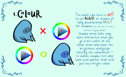

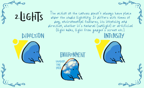

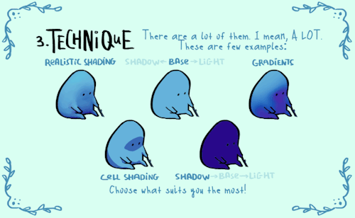

here comes small shading…tutorial? set of advises?? name it whatever you want. hope someone of y’all will find it at least a bit helpful!
special thanks to @cozy-capybara for literally inspiring me to make this thing
-
 blackblood-tonic liked this · 4 months ago
 -
 malkaviian reblogged this · 5 months ago
 -
 art-of-amms liked this · 5 months ago
 -
 realtsubasayuunagi liked this · 1 year ago
 -
 jackerblitz liked this · 1 year ago
 -
 ortensiaa reblogged this · 1 year ago
 -
ortensiaa liked this · 1 year ago
-
 sigmaticsaki liked this · 1 year ago
 -
 kotomeanies reblogged this · 1 year ago
 -
 darlingdearesth reblogged this · 2 years ago
 -
 karterkarterkarter liked this · 2 years ago
 -
 nillarose02 liked this · 2 years ago
 -
 lilkittynightmare liked this · 2 years ago
 -
 grosski liked this · 2 years ago
 -
 nyasogiandchuunosuke liked this · 2 years ago
 -
 the-fandom-panda liked this · 2 years ago
 -
 approvedmood liked this · 2 years ago
 -
 stcrlites liked this · 3 years ago
 -
 fandom-house liked this · 3 years ago
 -
 absurdlygrimm liked this · 3 years ago
 -
 hydrangeahelper liked this · 3 years ago
 -
 convivialcrow liked this · 3 years ago
 -
 sevenknightingales liked this · 3 years ago
 -
 thefoxwhodraws liked this · 3 years ago
 -
 littlee-coaastline liked this · 3 years ago
 -
99brbs liked this · 3 years ago
-
 chxerryy liked this · 3 years ago
 -
 jessicadexler reblogged this · 3 years ago
 -
 h-doodles liked this · 3 years ago
 -
 lufurus liked this · 3 years ago
 -
 bajichurrasqueiro liked this · 3 years ago
 -
 noxierre liked this · 3 years ago
 -
 annefraid liked this · 3 years ago
 -
 not-sure-why-im-here liked this · 3 years ago
 -
 sanayeon liked this · 3 years ago
 -
 onedayimgonnausethese reblogged this · 3 years ago
 -
 ericthehalibut reblogged this · 3 years ago
 -
 allyartisty liked this · 3 years ago
 -
 hydralisk98 reblogged this · 3 years ago
 -
hydralisk98 liked this · 3 years ago

Sylwester | i will mostly post sketches, because i'm too lazy to end them
196 posts